Registration Flow – UX Design Case Study
Streamlining User Registration from Start to Completion
Introduction
Introduce the challenge – “Our team embarked on a mission to redesign the registration flow for a better, smoother user experience. Our goal was to boost engagement and reduce drop-offs, ultimately increasing conversion rates from registration to payment completion.”
Problem Defination
Users were dropping off significantly at various stages of the registration flow, especially before payment completion. The existing design had pain points that created friction, leaving room for improvement to make the journey more intuitive.
Key Design Focus:
- Reduce friction points - Simplify and streamline.
- Increase clarity and ease - Make each step obvious and intuitive.
- Boost conversion rates - Guide users through to payment.
Competitor Analysis Insights
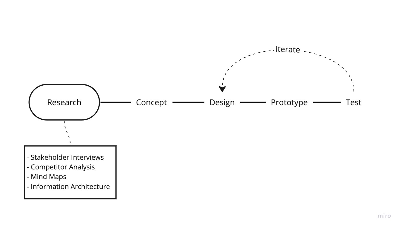
We analyzed competitors with high conversion rates and seamless registration experiences. This helped us understand what users expect in terms of speed, clarity, and intuitiveness.
Key takeaways:
- Simplified Forms - Competitors minimized required fields, reducing cognitive load.
- Consistent Feedback - Users received immediate feedback on inputs, building confidence.
- Clear Calls to Action (CTAs) - Clear, actionable language that encouraged progress.
